How to Bold Text in LinkedIn Posts: A Practical Guide
Learn how to bold text in linkedin posts with proven methods to make your content stand out and drive engagement.

To bold text in a LinkedIn post, the most direct method is to use a Unicode text generator. Simply type your text into one of these free online tools, choose a bold style, copy the generated text, and paste it directly into the LinkedIn post editor.
Why There’s No Bold Button on LinkedIn (and the Smart Way Around It)
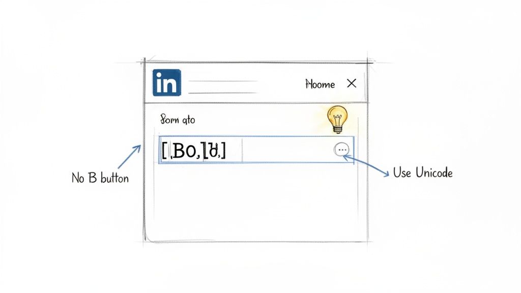
If you're asking, "Why can't I bold text on LinkedIn?", you're not alone. LinkedIn's post editor intentionally lacks formatting buttons like bold and italics. The platform's goal is to maintain a clean, uniform appearance across the feed, ensuring a consistent professional experience on all devices.
While this design choice promotes consistency, it poses a challenge for users who want to make their content more readable and engaging. The solution is a clever workaround using Unicode, a universal standard for encoding text and symbols that all modern devices understand.
How Formatting with Unicode Works
When you use a text generator to make your text bold, it isn't applying a traditional font style. Instead, it swaps standard letters for special Unicode characters that are designed to look bold. You copy these special characters and paste them into your post. Because LinkedIn's platform supports the Unicode standard, they appear correctly formatted in the feed.
This method is invaluable for founders, marketers, and sales professionals who need their message to stand out. On a platform with over 582 million monthly active users, grabbing attention is critical.
Creators who master workaround formatting—like line breaks and Unicode—see up to 40% higher read-through rates past the critical ‘See More’ cutoff. You can review the full analysis about LinkedIn post formatting on MagicPost.
A small amount of strategic bolding can be the difference between a post that is ignored and one that stops the scroll, captures attention, and drives meaningful conversations.
Using Unicode Generators to Create Bold Text
If you've ever wondered how to make text bold directly in a LinkedIn post, the answer is a Unicode text generator. These tools provide the quickest and most common method for formatting.
They are simple, free websites that convert your standard text into special Unicode characters that appear bold. You copy the result and paste it directly into your LinkedIn post, making key phrases or numbers stand out.
Let's say you're a marketer sharing a new case study. You want to ensure the headline and a key metric don't get lost in the feed.
Step-by-Step Guide: How to Bold Text on LinkedIn
Here is a simple, step-by-step process for bolding text in your LinkedIn posts:
- Write Your Post: Draft your LinkedIn post as you normally would, identifying the words or phrases you want to emphasize.
- Open a Unicode Generator: In a new browser tab, open a Unicode text generator. We will compare a few options below.
- Enter Your Text: Type or paste the text you want to make bold into the generator's input box. For example, "New Case Study Released" or a specific metric like "45% Increase in Leads."
- Select and Copy the Bold Style: The tool will instantly display your text in various styles. For a professional look, choose a clean style like Bold (Serif) or Bold (Sans-Serif). Click the "copy" button next to your chosen style.
- Paste into LinkedIn: Return to your LinkedIn post draft and paste the copied bold text exactly where you want it.
- Bold Your Hooks and Key Numbers: Start your post with a bolded first line to grab attention immediately. Also, bold any standout metrics like "85% of users" or "$2M in revenue" to make them pop.
- Use Simple Bullet Points: When presenting a list or key takeaways, use simple emoji bullets like → or • to break up the text and make complex information easier to digest.
- Embrace White Space: Never underestimate the power of a blank line. Short paragraphs and deliberate line breaks give your content breathing room, making it feel less intimidating and more conversational.
- The hook that grabs attention at the start.
- A critical number, statistic, or data point.
- Your primary call-to-action (CTA).
The visual impact is immediate. This simple formatting guides the reader's eye and makes your post much easier to scan.
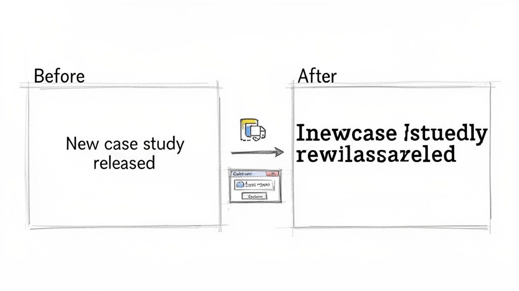
Before:
New Case Study Released! We worked with an amazing client and achieved a 45% increase in leads in just 90 days.After:
New Case Study Released! We worked with an amazing client and achieved a 45% increase in leads in just 90 days.
This technique is my go-to for creating scannable, high-impact content in seconds, without needing complex tools.
Comparison of Unicode vs. Native Formatting
Bold Text Generators: A Quick Comparison
While many generators exist, they differ in usability and features. Some are cluttered with ads, while others offer a cleaner experience. Here is a comparison of popular choices to help you find the best tool for your needs.
For most professional posts, a straightforward tool like YayText is ideal. It’s fast, clean, and efficient, which is exactly what you need when you're busy.
Strategic Formatting for Maximum Readability
Knowing how to make text bold is just the first step. The most effective posts combine bolding with other visual cues to create content that is easy to scan and genuinely engaging. This strategy transforms a "wall of text" into a post people actually stop to read.
Your primary goal is to guide the reader's eye. The same text generators can create Unicode italics, which are perfect for adding nuance to a quote or emphasizing a thought without the strong visual stop of bold text.
However, great formatting extends beyond text styles to the entire structure of your post.
Every minute, LinkedIn sees thousands of connections and job applications, yet only well-formatted posts consistently cut through the noise. Posts simulating bold text can lift impressions by 35% on average. Discover more about optimizing post length and structure from Sendible's latest guide.
This data underscores the importance of visual presentation, especially since most users scroll on mobile devices where dense text is an immediate turn-off.
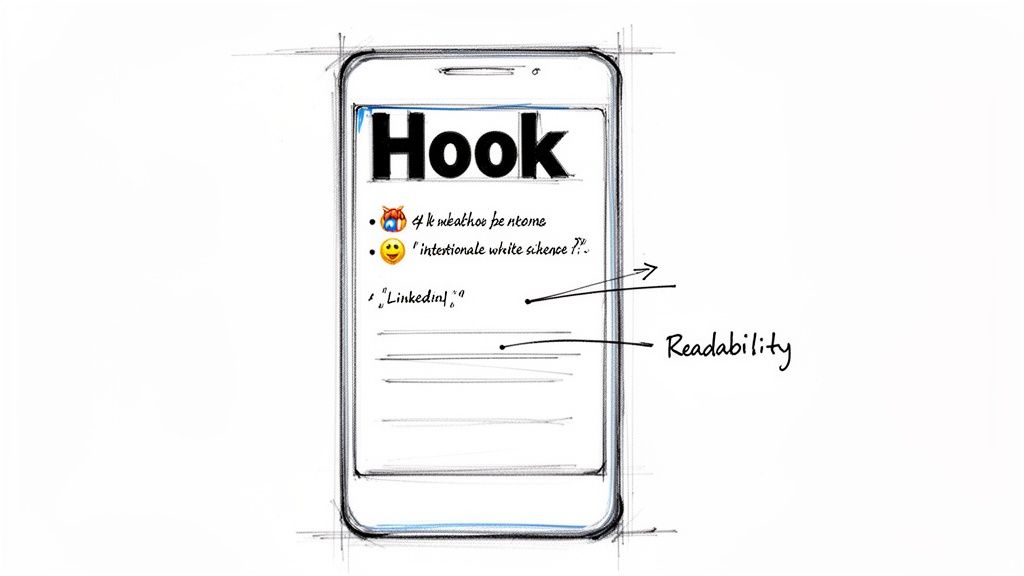
Building a Readable Post Structure
To prevent readers from scrolling past your content, adopt a designer's mindset. The most successful long-form posts on LinkedIn use a mix of elements to maintain reader engagement.
Here is a simple framework for structuring your posts:
By combining these techniques, you create content that doesn't just get seen—it gets absorbed. For a deeper look at weaving these elements into a compelling narrative, see our complete guide on how to write LinkedIn posts that drive real engagement.
Will Using Unicode Hurt My Post's Accessibility or Reach
This is an important question. When trying to make your content stand out, you don't want to inadvertently harm its reach or exclude part of your audience. The answer requires finding the right balance.
Let's address accessibility first. When you use a text generator for bolding, you are not applying standard bold formatting. You are swapping normal letters for mathematical alphanumeric symbols from the Unicode character set.
To most people, these look like bold letters. However, for someone using a screen reader due to a visual impairment, the experience is very different. The software might read these special characters individually (e.g., "A," "p," "p," "l," "e") or announce something confusing like "mathematical bold capital A." This can make your key message incomprehensible.
This is why moderation is crucial. Highlighting a single keyword or a short phrase is generally fine. But formatting entire sentences this way creates a frustrating barrier for anyone using assistive technology.
My golden rule is simple: your message must be perfectly clear even if the stylized text were removed entirely. Use it for a little extra pop, not to carry the core of your message.
Does Unicode Affect Post Reach?
A common concern is that LinkedIn's algorithm might penalize posts for using these "fancy" characters, thereby reducing their reach. This is largely a myth. LinkedIn's entire platform is built on Unicode to support emojis, various languages, and symbols.
When used sparingly, a few bolded words will not cause your post to be demoted. The algorithm prioritizes genuine engagement—comments, shares, and the time people spend reading your post.
In fact, when used strategically, bold text can make your post more scannable and visually appealing. This can actually improve your post's performance and help you gain more impressions on LinkedIn.
The goal is to use formatting to enhance your content, not obscure it.
Going Beyond Posts: Where LinkedIn Gives You More Formatting Control
While Unicode generators are essential for the main feed, they are just one tool available. In other areas of the platform, LinkedIn provides powerful, built-in formatting options that allow you to create richer, more professional content without copy-paste workarounds.
The best place to find these native tools is in LinkedIn Articles. Consider Articles the home for your most important, in-depth content—the kind that establishes you as an expert. Unlike a standard post, the Article editor is a proper WYSIWYG (What You See Is What You Get) interface.
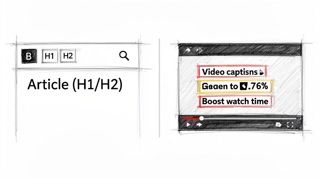
This means you get actual buttons for bold, italics, and underlining. More importantly, you can structure your content with H1 and H2 headings, blockquotes, and bullet points. If you're writing a detailed guide or a thought leadership piece that needs to be easy to read and have a long shelf life, Articles are the superior choice. The clean, native formatting makes a significant difference in readability.
Making Your Video Content Pop
Video is another area where formatting knowledge is beneficial. While you can't natively bold text in a video’s description, you can use the same Unicode tricks to make your hook or call-to-action stand out. This is a tactic I frequently use to grab attention right below the video player.
Frankly, how you handle the text around your video is a massive part of its success.
Research has shown that adding bold-like characters and symbols to a video's accompanying text can boost its performance by as much as 30%. With the first few lines of your post driving over 80% of all plays, a hook that visually pops isn't just nice to have—it's essential.
This data highlights the need for a clear visual hierarchy in your posts.
You can also "burn" bolded text directly into your video as captions. This ensures your key messages land with impact, even for viewers watching with the sound off. For example, displaying a key data point on screen as "5.60% interaction rate" makes it far more memorable. For a deeper dive into the different character counts and rules across LinkedIn, check out our complete guide on the LinkedIn post character limit.
Your Top Questions About Bolding on LinkedIn, Answered
Once you start using bold text in your posts, some common questions may arise. Let's address them so you can format your content with confidence.
Will LinkedIn's Algorithm Punish Me for Using Bold Unicode Text?
This is the most frequent question. The short answer is no, LinkedIn will not penalize your account for using Unicode.
The platform's entire system relies on Unicode to handle countless languages and emojis. These bold characters are simply part of that system. The algorithm is far more concerned with engagement metrics like likes, comments, and shares. If your smart formatting makes the post easier to read and more engaging, you are actually helping your performance, not hurting it.
Do These Bold Characters Show Up on Every Device?
For the most part, yes. Any reasonably modern phone, tablet, or computer will display these characters correctly. You can expect your bold text to look great on almost all iPhones, Android devices, and standard web browsers.
Occasionally, a user with a very old or unusual device might see a plain box (□) instead of the bold character.
This is exactly why moderation is key. Your post should still make perfect sense and be easy to read even if the bolding fails to render for a tiny fraction of your audience. Think of it as an enhancement, not a crutch.
How Do I Know if I'm Using Too Much Bold Text?
It's easy to overdo it. A good rule of thumb is to limit bolded words to 10-15% of your total text, at most. Use it as a highlighter for the most critical parts of your message.
Bold text is most effective when used for a few key elements:
When you bold entire sentences or paragraphs, the impact is lost. The text becomes a dense, shouting block that is difficult to scan, which defeats the purpose of formatting.
Are There Browser Extensions to Make This Easier?
Yes, you can find browser extensions that generate stylized text. Some users prefer them for convenience.
However, I find it just as easy—and often cleaner—to keep a simple text generator open in a browser tab. This avoids installing extra software and simplifies my workflow, especially when I need to publish content quickly.
Ready to create authentic, high-quality LinkedIn posts that sound like you? Brewbrand learns your unique voice and generates ready-to-go content in under two minutes, saving you hours every week. Try it for free and start writing 10x faster at https://brewbrand.ai.
Generate LinkedIn content easier than ever before
Lorem ipsum dolor sit amet, consectetur adipiscing elit. Lorem ipsum dolor sit amet, consectetur.